Join the Hide community
Get access to live stream, lessons, the post exchange, and chat with other snipers.
Register
Download Gravity Ballistics
Get help to accurately calculate and scope your sniper rifle using real shooting data.

Install the app
How to install the app on iOS
Follow along with the video below to see how to install our site as a web app on your home screen.
Note: This feature may not be available in some browsers.
You are using an out of date browser. It may not display this or other websites correctly.
You should upgrade or use an alternative browser.
You should upgrade or use an alternative browser.
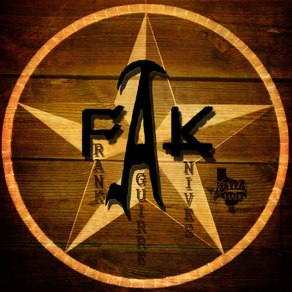
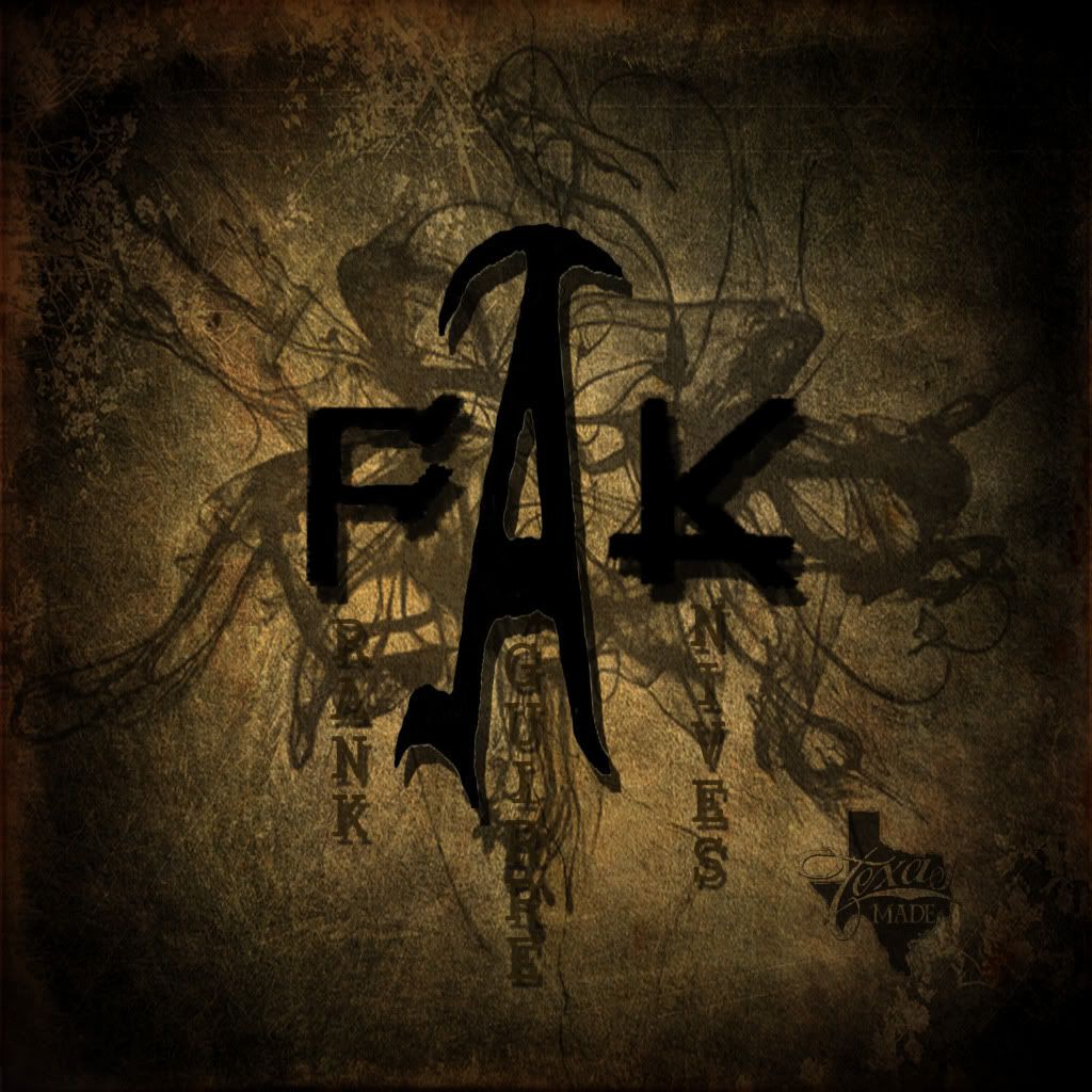
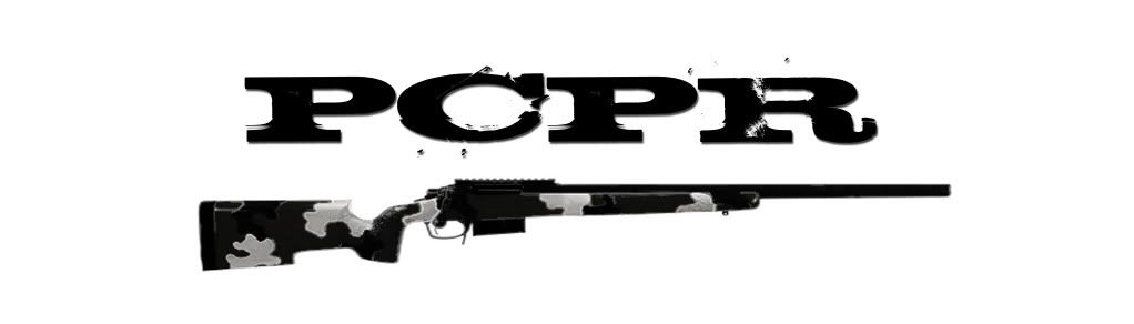
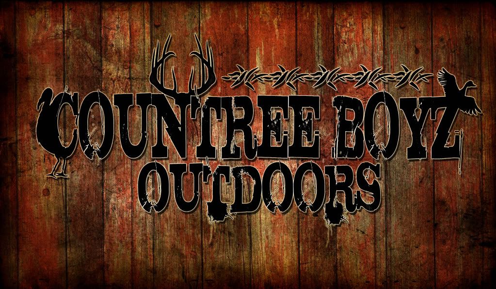
Gunsmithing gunsmith logo, SNAGLYTOOTH Logo for rifle matches
- Thread starter 7remmag
- Start date
Re: made a gunsmith logo...
Looks great, only advice i could give would be to rotate the stamp up a little bit on the barrel. good work
Looks great, only advice i could give would be to rotate the stamp up a little bit on the barrel. good work

Re: made a gunsmith logo...
Be real careful about how busy you make those backgrounds. Not enough contrast for my eyes. Kinda defeats the purpose of the logo which is not to demonstrate your art at the end of the day but rather make the brand stick in the mind of the viewer.
Be real careful about how busy you make those backgrounds. Not enough contrast for my eyes. Kinda defeats the purpose of the logo which is not to demonstrate your art at the end of the day but rather make the brand stick in the mind of the viewer.
Re: made a gunsmith logo...
Looks real good. I agree with the background comment as well as rotating logo further up on barrel so it is more visible. Great job!
Looks real good. I agree with the background comment as well as rotating logo further up on barrel so it is more visible. Great job!
Re: made a gunsmith logo...
Very artistic, but the last two are too busy. Takes away from the actual business you are trying to promote.
Very artistic, but the last two are too busy. Takes away from the actual business you are trying to promote.
Re: made a gunsmith logo...
Looks real good. How much would you charge to do a logo for my Gun smithing business.
Looks real good. How much would you charge to do a logo for my Gun smithing business.
Re: made a gunsmith logo...
Looks good buddy, We also need to add the other graphic you did that will sit just above the KYL rack on the back of the shirt.
Thanks
Looks good buddy, We also need to add the other graphic you did that will sit just above the KYL rack on the back of the shirt.
Thanks
Re: made a gunsmith logo...
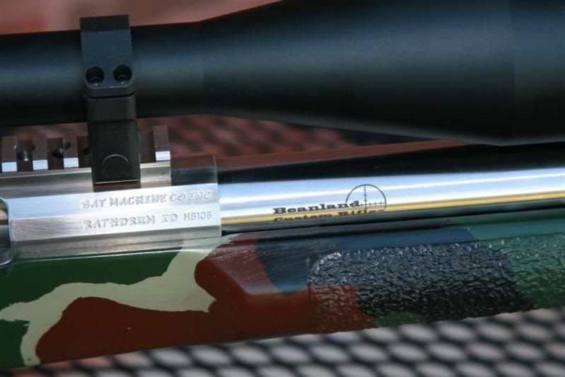
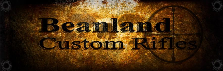
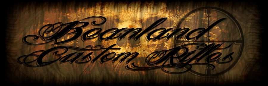
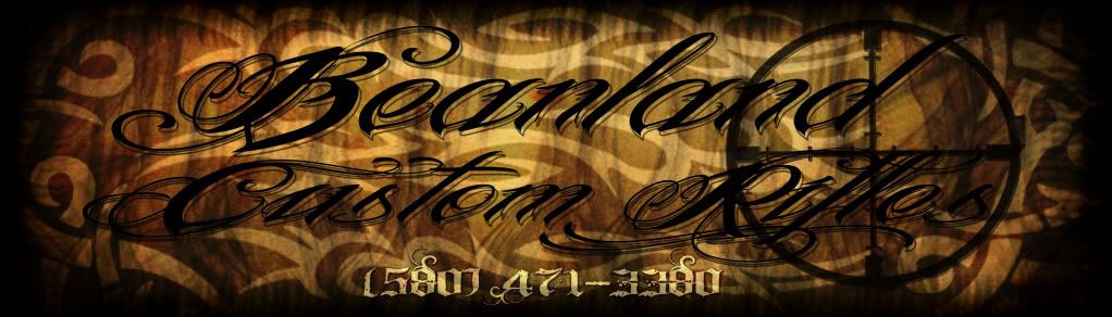
That beanland logo with the skull in the background looks great.
<div class="ubbcode-block"><div class="ubbcode-header">Originally Posted By: rware91</div><div class="ubbcode-body">Looks great, only advice i could give would be to rotate the stamp up a little bit on the barrel. good work</div></div>
The reflection of the stock in the stainless barrel is causing it to look that way. It actually is positioned very well. I have several beanland builds.
Re: made a gunsmith logo...
Pretty nice skills there with the logos... good job!!
How much do you charge for stuff like that??
DK
Pretty nice skills there with the logos... good job!!
How much do you charge for stuff like that??
DK
Re: made a gunsmith logo...
I like it! I wish I could of put our club logo on my new barrel after I got done cutting and chambering it.
I like it! I wish I could of put our club logo on my new barrel after I got done cutting and chambering it.
Re: made a gunsmith logo...
<div class="ubbcode-block"><div class="ubbcode-header">Originally Posted By: gouldmafia</div><div class="ubbcode-body">wish i could help you out JF, but i don't have the stuff to put logos on metal. wish i did.</div></div>
No worries man, if you ever move in that direction let me know.
<div class="ubbcode-block"><div class="ubbcode-header">Originally Posted By: gouldmafia</div><div class="ubbcode-body">wish i could help you out JF, but i don't have the stuff to put logos on metal. wish i did.</div></div>
No worries man, if you ever move in that direction let me know.
Re: made a gunsmith logo...
Thought I would post a pic of how the shirts turned out
Thanks for your help with the design.
Oh and I did send your shirts out today.

Thought I would post a pic of how the shirts turned out
Thanks for your help with the design.
Oh and I did send your shirts out today.
Re: made a gunsmith logo...
<div class="ubbcode-block"><div class="ubbcode-header">Originally Posted By: SNAGLYTOOTH</div><div class="ubbcode-body">Thought I would post a pic of how the shirts turned out
Thanks for your help with the design.
Oh and I did send your shirts out today.
</div></div>
Oh, bad ass!!
<div class="ubbcode-block"><div class="ubbcode-header">Originally Posted By: SNAGLYTOOTH</div><div class="ubbcode-body">Thought I would post a pic of how the shirts turned out
Thanks for your help with the design.
Oh and I did send your shirts out today.
Oh, bad ass!!

Similar threads
Suppressors
Will suppressor impact the POI?
- Replies
- 11
- Views
- 432
- Replies
- 1
- Views
- 366