Hey all!
I'm Will with Audentio; we did the redesign for Sniper's Hide, and I'm the developer who was in the lead on this project (so, if you've got any hate to send regarding code, I'm you're target).
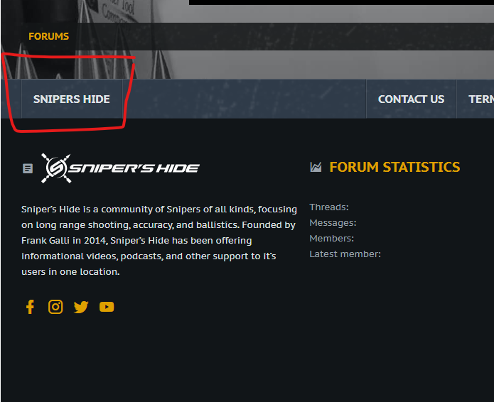
We wanted to get a dedicated thread going for feedback on the new styles. We had a rocky day when we first launched due to a few technical difficulties on one aspect of the upgrade, so we decided to revert the look back to the original styles for the time being. Now, however, the new styles are available for you to try out. If you go to the bottom of the site and click on the area highlighted in the screenshot below, you'll be able to change styles to the new ones, which are "Sniper's Hide (2020)" and "Sniper's Hide Dark (2020)". The first is a light style, while the second is dark.

Here's some notes on what we've tweaked since our initial launch attempt:
Here's what we're looking for in feedback:
Some final thoughts: While some aspects of the changes may not make sense to people who've been on here for a while, there is actually a method to the madness. We've been doing this stuff a LONG time, and ultimately, we want to ensure that this community continues to grow and prosper (we wouldn't be in business very long if we didn't). Give the new looks a bit and you may find you like it more in some ways. Once you've had some time with the new stuff, let us know your thoughts here. Ultimately, however, Frank is the king of the castle, and he's the one we'll check with before we do anything.
Anyway, from me personally, I may be coming back in the future to get some thoughts on finally getting back into shooting; I used to when I was young, and have missed doing it. Nothing like real marksmanship; Mostly dealing with small varmints and max 100 yard target shooting (typically just ironsights, because we were poor and couldn't afford decent optics ).
).
I'm Will with Audentio; we did the redesign for Sniper's Hide, and I'm the developer who was in the lead on this project (so, if you've got any hate to send regarding code, I'm you're target).
We wanted to get a dedicated thread going for feedback on the new styles. We had a rocky day when we first launched due to a few technical difficulties on one aspect of the upgrade, so we decided to revert the look back to the original styles for the time being. Now, however, the new styles are available for you to try out. If you go to the bottom of the site and click on the area highlighted in the screenshot below, you'll be able to change styles to the new ones, which are "Sniper's Hide (2020)" and "Sniper's Hide Dark (2020)". The first is a light style, while the second is dark.
Here's some notes on what we've tweaked since our initial launch attempt:
- Font size has been bumped slightly; Something to note, however, is that you can actually set your own font size if you have difficulty with smaller type by going to your account preferences.
- We fixed a bug with the register button showing white on tablet/phone devices in the dark style
- We added in the bottom breadcrumb
- We added divider lines between the threads in the discussion lists
- We added the SH logomark as the icon for forums denoting read/unread.
- Also, your navigation hasn't disappeared; If you were used to having a second nav bar underneath the main one, those have been moved to be in drop-downs on the main nav (so, for instance, if you click on the down-arrow on the Forums option, you'll see all the sub-navigation items for Forums there). Regarding mobile, that has switched to a traditional hamburger-style navigation, which is pretty much standard now for anything on the web (much less wasted space, so you don't have to scroll as much to read longer content).
Here's what we're looking for in feedback:
- If you encounter anything that looks like a bug, be as descriptive as you can be! Screenshots are great, and help us isolate issues.
- If there is functionality you're used to that seems to be missing, it may have moved (I covered some stuff above), so be sure to check twice before you post about it.
- If you're having problems due to visibility overall (such as text being hard to read), let us know where and give us a screenshot. If you've got thoughts on improvement on that front, don't hesitate to say something.
- Finally, we only want positive feedback. If you don't like it, too bad (just kidding - I get that changes like this can be jarring, so feel free to vent at me).
Some final thoughts: While some aspects of the changes may not make sense to people who've been on here for a while, there is actually a method to the madness. We've been doing this stuff a LONG time, and ultimately, we want to ensure that this community continues to grow and prosper (we wouldn't be in business very long if we didn't). Give the new looks a bit and you may find you like it more in some ways. Once you've had some time with the new stuff, let us know your thoughts here. Ultimately, however, Frank is the king of the castle, and he's the one we'll check with before we do anything.
Anyway, from me personally, I may be coming back in the future to get some thoughts on finally getting back into shooting; I used to when I was young, and have missed doing it. Nothing like real marksmanship; Mostly dealing with small varmints and max 100 yard target shooting (typically just ironsights, because we were poor and couldn't afford decent optics
Last edited:

