Like what you done with placeHey all!
I'm Will with Audentio; we did the redesign for Sniper's Hide, and I'm the developer who was in the lead on this project (so, if you've got any hate to send regarding code, I'm you're target).
We wanted to get a dedicated thread going for feedback on the new styles. We had a rocky day when we first launched due to a few technical difficulties on one aspect of the upgrade, so we decided to revert the look back to the original styles for the time being. Now, however, the new styles are available for you to try out. If you go to the bottom of the site and click on the area highlighted in the screenshot below, you'll be able to change styles to the new ones, which are "Sniper's Hide (2020)" and "Sniper's Hide Dark (2020)". The first is a light style, while the second is dark.
View attachment 7281236
Here's some notes on what we've tweaked since our initial launch attempt:
- Font size has been bumped slightly; Something to note, however, is that you can actually set your own font size if you have difficulty with smaller type by going to your account preferences.
- We fixed a bug with the register button showing white on tablet/phone devices in the dark style
- We added in the bottom breadcrumb
- We added divider lines between the threads in the discussion lists
- We added the SH logomark as the icon for forums denoting read/unread.
- Also, your navigation hasn't disappeared; If you were used to having a second nav bar underneath the main one, those have been moved to be in drop-downs on the main nav (so, for instance, if you click on the down-arrow on the Forums option, you'll see all the sub-navigation items for Forums there). Regarding mobile, that has switched to a traditional hamburger-style navigation, which is pretty much standard now for anything on the web (much less wasted space, so you don't have to scroll as much to read longer content).
Here's what we're looking for in feedback:
- If you encounter anything that looks like a bug, be as descriptive as you can be! Screenshots are great, and help us isolate issues.
- If there is functionality you're used to that seems to be missing, it may have moved (I covered some stuff above), so be sure to check twice before you post about it.
- If you're having problems due to visibility overall (such as text being hard to read), let us know where and give us a screenshot. If you've got thoughts on improvement on that front, don't hesitate to say something.
- Finally, we only want positive feedback. If you don't like it, too bad (just kidding - I get that changes like this can be jarring, so feel free to vent at me).
Some final thoughts: While some aspects of the changes may not make sense to people who've been on here for a while, there is actually a method to the madness. We've been doing this stuff a LONG time, and ultimately, we want to ensure that this community continues to grow and prosper (we wouldn't be in business very long if we didn't). Give the new looks a bit and you may find you like it more in some ways. Once you've had some time with the new stuff, let us know your thoughts here. Ultimately, however, Frank is the king of the castle, and he's the one we'll check with before we do anything.
Anyway, from me personally, I may be coming back in the future to get some thoughts on finally getting back into shooting; I used to when I was young, and have missed doing it. Nothing like real marksmanship; Mostly dealing with small varmints and max 100 yard target shooting (typically just ironsights, because we were poor and couldn't afford decent optics).
Join the Hide community
Get access to live stream, lessons, the post exchange, and chat with other snipers.
Register
Download Gravity Ballistics
Get help to accurately calculate and scope your sniper rifle using real shooting data.

Install the app
How to install the app on iOS
Follow along with the video below to see how to install our site as a web app on your home screen.
Note: This feature may not be available in some browsers.
You are using an out of date browser. It may not display this or other websites correctly.
You should upgrade or use an alternative browser.
You should upgrade or use an alternative browser.
Forum redesign feedback thread
- Thread starter will-audentio
- Start date
we had to take the search, Threadloom offline,
Those site hiccups, the slowdowns and the crashes were being caused by the enhanced search
So unfortunately as with many things, changing one things affects others and in this case breaks some too
Those site hiccups, the slowdowns and the crashes were being caused by the enhanced search
So unfortunately as with many things, changing one things affects others and in this case breaks some too
Color scheme for me seems to have changed this morning, Snipers Hide Light 2020 looks completely different.
I turned off the old themes,
You are gonna have to use the new ones, especially once the site is finished,
There are 3 new themes, bottom left corner to switch, it will be necessary to use the correct theme or down the road it won't work
I just changed it so you can get used them,
You are gonna have to use the new ones, especially once the site is finished,
There are 3 new themes, bottom left corner to switch, it will be necessary to use the correct theme or down the road it won't work
I just changed it so you can get used them,
I am sure it is, but as I said, we are still in the middle of working on stuff and honestly the favicon is the last thing I am worried about right now,
get the two sides to play nice is more important, that is punch list stuff at the end
get the two sides to play nice is more important, that is punch list stuff at the end
Everything has just gone to the light theme, went to preferences and dark has disappeared. Selected the earth theme and it's still light. Am I missing a trick?
just use the one labeled Snipers Hide.
In case you missed it,
We are in damage control mode, trying to isolate the crashes that have been happening,
One of the areas we are checking is the Themes, to make sure the new theme is not conflicting somehow as this is a process to determine the root cause of the errors. I get it's annoying but it's necessary.
I have already banned people for questioning the theme change as I posted it would happen, and not to complain.
So, I would sit back and wait for the all-clear because I have absolutely no sense of humor over this when things are not working as expected.
You should bite your tongues for a while,
In case you missed it,
We are in damage control mode, trying to isolate the crashes that have been happening,
One of the areas we are checking is the Themes, to make sure the new theme is not conflicting somehow as this is a process to determine the root cause of the errors. I get it's annoying but it's necessary.
I have already banned people for questioning the theme change as I posted it would happen, and not to complain.
So, I would sit back and wait for the all-clear because I have absolutely no sense of humor over this when things are not working as expected.
You should bite your tongues for a while,
Apologies Frank, I missed the memo and wasn’t bitching. I’ll standby for further news. Hope it’s a quick fix for you and I’m sorry to add to the traffic. Love the site!
Not sure if this has come up yet, but I have encountered random bug where one or more photos in a thread only loads 1/3 or 1/2. Clicking the photo url in the thread vs the actual photo, results in a dedicated window, photo @ 100%. Other photos same thread clicking on photo or url load 100%. This is on iPad in landscape or portrait, latest os. Using forward back arrows on photos to advance to next loads 100%, but backing up buggy phot still only partially loads.
A new issue I noticed this morning that's still happening. I can't upload a photo in posts or PMs. When I click on the icon then click the button that says "Drop Image (Or click here)" my gallery opens up then the web page freezes then reloads. The first time it happened I did get a forum error message but I haven't seen it since.
Not sure if this has been addressed, but the top header or menu bar which shows your name and the PM and Alert icon, this used to "stay on top" when scrolling down through a thread, but now it disappears. Is there a setting to get this to stay back at the top as it is not convenient to have to scroll all the way back up to access my next alert after reading down into a thread.
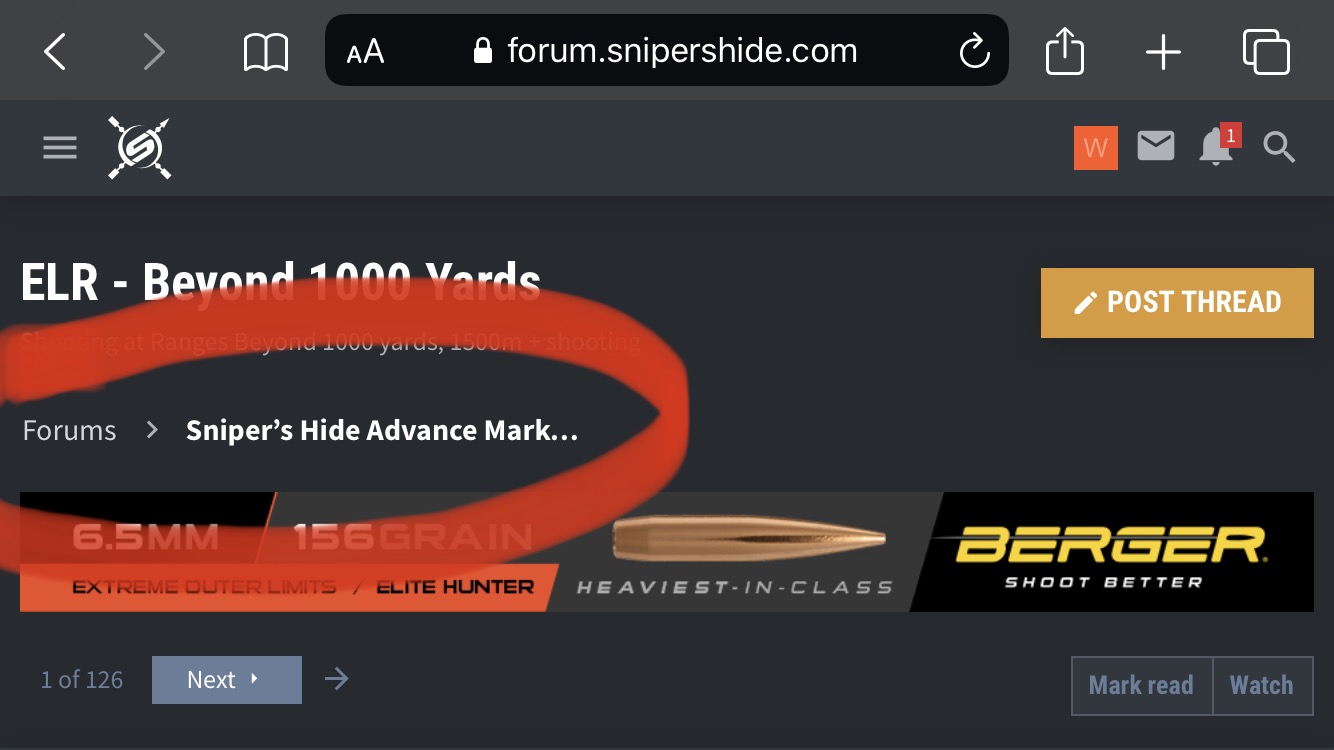
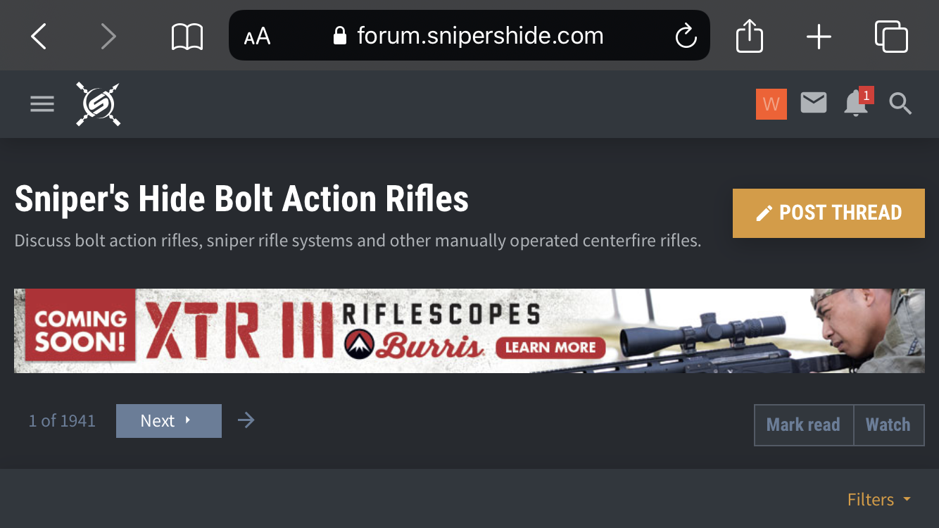
If I click on any subsection under Snipers Hide armory and supply, there isn’t a quick link back to the main forum page like there is when I am in any other subsection that is outside this area. I am on my Iphone. Photos for example.


